I have noticed a few don't, but everyone has them.
in:
C:\Program Files (x86)\Steam\steamapps\common\railworks\dev\Shaders
copy 2 files, ShaderDesc.txt and App.fbk into your 3DS max plugcfg folder. (the one in users)
C:\Users\RSderek\AppData\Local\Autodesk\3dsmax\2011 - 32bit\enu\plugcfg
The last shader in the kuju list should be: TrainShadowOnlyDiffuse.fx
regards
Derek
Thursday, 2 August 2012
Wednesday, 25 July 2012
Quiet?
This blog is my own personal one and not an rs one. I update it when I want,can or requested.
I have my own personal projects on the go as well as a full quota at work. That coupled with football, painting and family leaves me little time.
D
I have my own personal projects on the go as well as a full quota at work. That coupled with football, painting and family leaves me little time.
D
Wednesday, 13 June 2012
Mapping a simple building in 3DS max
In the previous post I talked about General texturing. I skipped the bit about mapping, sorry.
There are a number of ways to map/edit textures to polygons, and I use different methods depending on what it is I am modelling.
Here I will show you how to model a simple Farm building, It will be done in a few parts as each post takes a little time.
I will be using the same textures as the previous post. the texture is 1024 pixels high and 512 pixels wide. 2-1 ratio.
I create a box in max in the top view.
Length 5M
Width 5M
Height 10M
and I make sure Generate Mapping Coords is ticked.
I create a new kuju material (tex diff will do for now) and apply it to the object.
I convert the model to edit poly and in the front view I select the edit poly option and detach the front polygon, then delete the original shape so that I am left with a flat plane facing forwards, this is going to be the front of my building.
I select the poly option and select Slice in the modifier list.
Right click the orange slice plane and select slice plane.
This allows you to rotate and move the place around the object, if you have followed these steps the slice plane should be cutting your polygon through the middle in the horizontal plane.
I move my slice plane down to the bottom of my wall.
However I want to slice my polygon a number of times so I need to copy the slice plane.
I click on the slice plane in the modifier stack.
I then click on the modifier stack again and select paste.
Repeat the process of moving the slice plane to where you want to cut next.
Once done I collapse the stack and make the object edit poly again.
I now select each polygon and detach them till I have 4 different objects.
These 4 objects are all that is needed to make your basic shape.
Windows and doors will be cut in later.
I select the wall section and hide the other 3 objects.
I move the wall down till it is centered at 0.
I select line in the modifier window (1) and I tick the preserve UVs (2)
Now then as i want my building to be longer than 5 M's so I am going to drag the right hand edge. Because we have the preserved UV button ticked and our polygon is mapped perfectly you will see no distortion in the mapping as you make the wall as long as you want.
Once you have made the wall as long as you want un tick the preserve UV button.
End of Part 1
Thursday, 7 June 2012
Sunday, 3 June 2012
General Texturing
There is no right or wrong way to lay out a texture.
You can unwrap every polygon and give it it's own space on your UV unwrap but that is a huge waste of space and just not needed for most assets.
However, as I started texturing back in 1995 a 32/32 sized bit map was a big deal and I am always looking to get the most out of my textures.
Do more with less better.
You can of course make the best/largest texture you can for each asset no matter what the size or where it would be used on your route, however your memory footprint will become a huge problem, as is seen on many freeware projects where the user has ticked the set object filter tab and added loads of different packs from many different creators.
My advice for route builders, only add what you need, or even better, set up your own provider product and make (or ask someone to make) what you need. This way you are in control of what gets loaded.
As a route builder you have to think about the trade off between detail and performance.
Asset builders, give some thought to what you are building and make sensible packs (if you intend to share) that contain a selection of useful and relevant assets that can share textures.
Of course not all assets can share textures but often you don't need to use a high res texture to get good detail.
Buildings and assets that are track side tend to get more detail and texture allocation than those further away from the track.
Generally it is best to have 1 asset 1 texture and 1 material. as that is 1 draw call. However it is rare where you can get away with this for most assets.
For the majority of my assets I use a texture layout that I often refer to as a ‘layered cake’ method because of the stacked horizontal strips of texture.
This approach allows me to tile the texture in the ‘U’ direction allowing a higher texel size.
For scenery assets I often make the texture before i make the 3D model. I think about the building I want to make. I often make these textures 1024/512 pixel size.
Example of farm building:
I have a photograph of a building I want to make, it is made of stone and has a tiled roof and a side building with a corrugated steel roof. It also has a selection of doors and windows all painted green.
I make the wall material and the 2 roof materials along with a thing structural support type material for beams and put this into 1 texture.
Note, it is also wise to not mix wall and roof textures on upright and horizontal surfaces if you plan on making winter variations.
So, once I have made my base texture I then make my simple building.
This building is all tiled in the U so can be as long or as deep as you wish.
However, you can see at the end there is a visible join where I have added the apex section. To get rid of this I sliced the end section and shifted the mapping in the vertical. This method can be used to make your building taller, shifting the mapping in the U slightly on each layer can also help reduce and visible tiling.
I then mirrored the front and side to have a textured building shaped box.
Now that I have my basic shape I make a second texture, this I call my detail texture
The detail textures I often make 512/512, however it does really depend on the size of building and how many different types of buildings you want to apply these textures too.
Once I have my selection of doors and windows I cut my doors and windows into my simple shape.
I add elements for window and door supports.
These 2 textures can then be used to make a whole selection of farm buildings.
I then unwrap and shadow bake the whole object and use the trainlightmapwithdiffuse material (explained earlier in this blog)
Changing one of the textures can then give you a whole new building:
Changing 2 textures can make it feel even more different and of course you can mix and match and make many different shapes of buildings with the same textures:
Each building I would make it's own shadow map of about 256/256 pixel size.
So for a small cost of textures/polygons you get a wide and varied range of detailed buildings.
d
Monday, 21 May 2012
What next?
Ok, open to suggestions. What on the art front has you stumped? Lofts? Track? fancy train shaders? animations or just some hints tips on modelling?
Feel free to request.
regards
Derek
Feel free to request.
regards
Derek
Friday, 11 May 2012
How to make a Platform light with emmisive glow
In the route of your ‘Provider’ make a new folder called Lights. This is where you will keep the
max, igs and xml files.
In the Lights folder make a Texture folder. This is where you will keep your textures
Step 1: Gizmo
creation
We need to make a Point light gizmo.
This is what we will use to determine where the light
effect gets generated from. This gizmo you will be able to move around in the
Asset editor.
I have made a 30cm Diameter sphere with a Tex material,
the texture is a bright pale yellow, 64/64 pixels, planar mapped from the top.
This I centred at 0/0/0 in max.
Export this into a igs file.
point_light.IGS
Step 2 Make the
point light xml.
Right click the point_light.IGS in the asset editor and
click new shape blueprint and select point light blueprint.
Treat this just like any other scenery object, name it in
the relevant fields, and give it a provider product in Primary named texture
set.
In the light component section give the light a radius, I
have given mine 10 (M)
Give your light a colour, I picked a warm yellow/orange.
Click Save.
Preview your shape and you will have your object in front
of you. Click the Day/Night cycle button in the top left flyout menu. Your
object should glow (because of the tex material)
Select your object and lift it up in the scene. You will
see that it now emanates light. Experiment with the light and radius values to
get the desired effect you want.
Step 3: Light
Asset Creation.
There will be at least 3 objects in your scene but 5
materials:
Objects in scene:
1_0500_LampPost
1_0500_bulb_day
1_0500_bulb_night (with Forward facing glow element)
I have a 4th object which is the glass.
1_0050_glass
Materials used:
Material 1 used on
1_0500_LampPost. It can have any material you want, I have a
TrainBasicObjectDiffuse. It uses 1 256/256 texture which I boxed mapped.
Material 2 used on 1_0500_bulb_day. It can have a tex or
a TrainBasicObjectDiffuse. It uses 1 32/128 texture which I planar mapped.
Material 3 used on 1_0050_glass. It has the Trainglass.fx
shader explained in a previous blog post.
Material 4 used on 1_0500_bulb_night This uses the TrainEmissiveGlow.fx
shader
In the sub material slot 1 I have a diffuse texture very
much like bulb day texture. However I colour the bulb section yellow (this is used
for the colour of the glow) Name this texture Bulb.ace
In the sub material slot 2 (making sure the same UV
channel is used (1)) I have a texture that is the same size as my bulb texture
but it is black and white. The white area defines the glow area, the black is
the non glow area. name this texture with Bulb_EM.ace
There is a second element (but part of the same object) to 1_0500_bulb_night
which is a simple plane centered through the bulb.
This plane uses material slot 5 which is AddATex. The
texture is all black except for a faint glow in the centre. make sure you name this with _nm so that it does not get compressed.
This material has the View facing flag ticked under the
Viewer Facing options.
Save the max file and export as an IGS, I called mine Platform_light.IGS
NB The bulbs are named so that the day bulb will show during
the day and the night bulb will show at night.
Step 4: Bringing
it all together.
In the asset Editor right click the platform_light.igs
and select New shape blueprint, then select scenery blueprint.
Preview shape, you lamp should be as you expect it. Click
on the day/night button and see your bulb glow.
Name the relevant fields, and give it a provider product
in Primary named texture set. Expand Children and click insert first.
Give the Child name/provider product and select your
previously made point light and click preview.
Your point light orb will be at 0/0/0 select it and move
to the correct place.
Click Save and Export.
Your light should now be viewable in game.
Monday, 23 April 2012
Monday, 9 April 2012
TrainLightBumpSpecMask
I have seen a few people confused on new shaders, also seen one person post up how it does not work when it is clear he has his material set up wrong.
So, here I am to teach those who want to get their learn on.
TrainLightBumpSpecMask
Use this shader on scenery objects that require normal maps, specular maps and ambient occlusion maps.
Ambient occlusion
In basic terms, when creating these assets, think of an ambient occlusion map as a shadow-map. Light areas of the map are unaffected and dark areas of the map represent the shadowy areas (under gutters or in crevices).
The Shader
Use this shader on foreground buildings. Group assets that are built specifically for use as a background object should not use this material.
Slot 1 is the diffuse texture. (1st mapping channel)
Slot 2 is the normal map (24bit) with specular map (8bit) in the alpha channel. (1st mapping channel)
Slot 3 is the Ambient Occlusion map. (second map channel (shadow/lightbake))
Generally, make slot 1 and slot 2 share the same UV channel 1, and the Ambient Occlusion map have a second UV mapping channel 2. This allows for the same flexibility as when using the old shadow-map technique on the old legacy assets.
Example
Trackside Buildings
One thing to understand about this material and Trainlightmap with Diffuse, surfaces that point upwards the shadow bake gets washed out by the sun because it is a light.
If the same shadow/light map was applied to a vertical surface in stead of a horizontal one the shadow is more pronounced. (see image 3)
Shining a torch in a shadowed baked area now gets lit up, you would not expect to see a soft shadow that was generated from a global light would you?
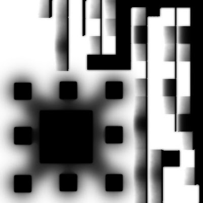
Example of the occlusion map.
Once you have your materials set up correctly you can see how it looks.
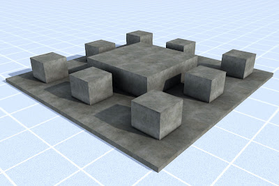
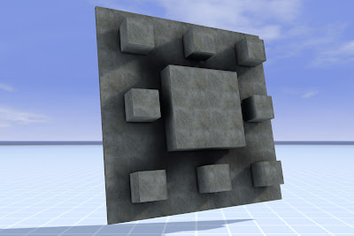
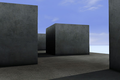
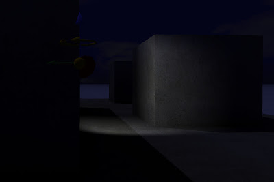 This is a great shader to use on stations or any other track side buildings. Buildings away from the track really do not need this material.
regards
Derek
Subscribe to:
Comments (Atom)


